“The brief is to revisit one of the exercises on daylight, artificial light or controlled light from Part 4 (Exercise 4.1, 4.2 or 4.3) and develop it into a formal assignment submission. The submission requirement for this assignment is a set of between six and ten high-quality photographic prints.” (course notes from OCA)
Under the present circumstances (Covid19), the requirement for prints has been waived and digital submission is required instead. However, I felt that I would miss out on a significant chunk of learning if I continued to produce only digital work. Therefore, I have produced prints and have made a video of them here.
I am also presenting my work in digital form as a series of slideshows comprising three versions each image – a straightforward photograph with minimal edits, a pixelated version of that photograph and a ‘painterly’ version of it. There are seven images in total.
Finally, for ease of viewing, I have also uploaded the first photograph of each set for closer scrutiny.

Image 1 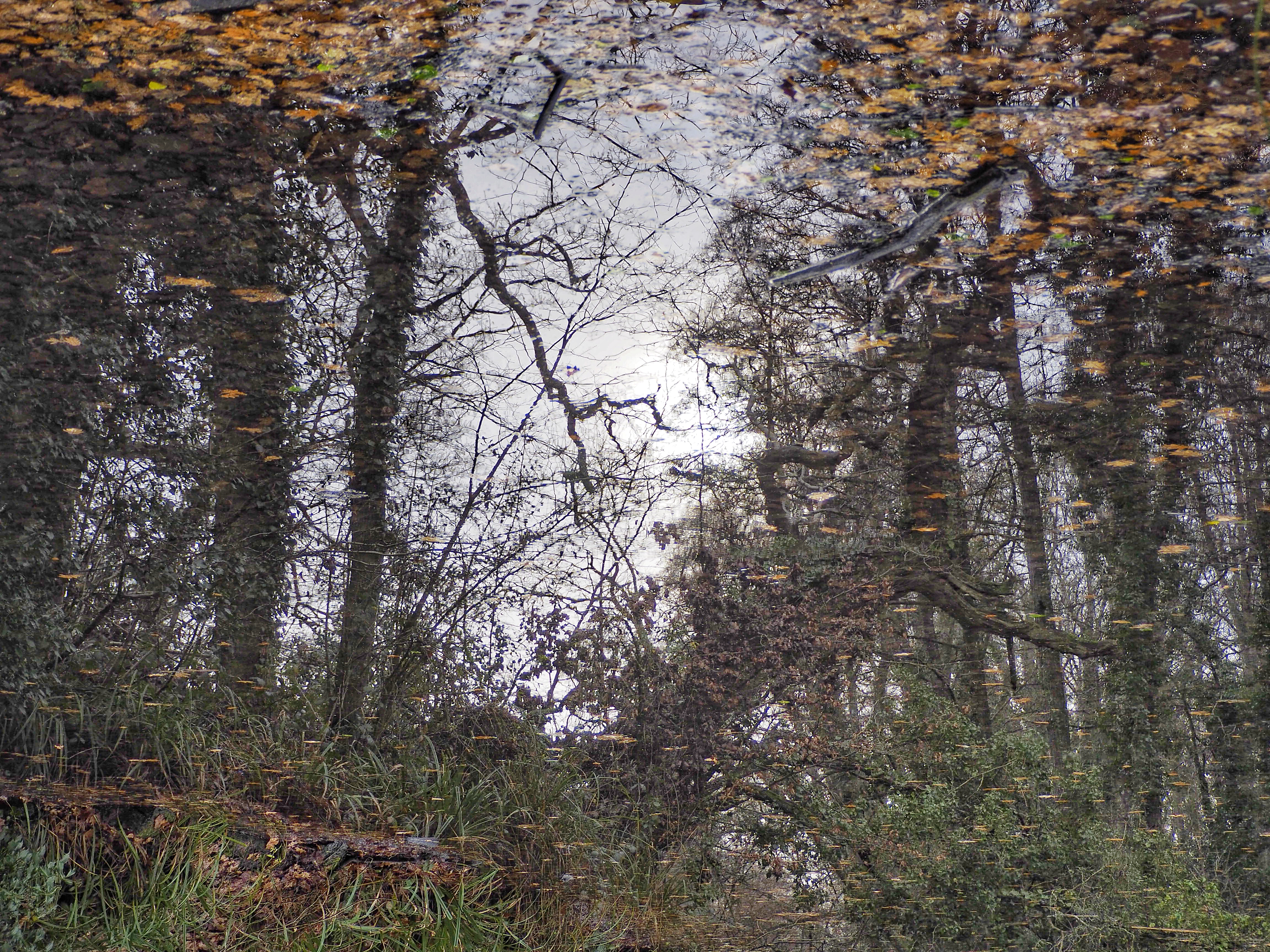
Image 2 
Image 3 
Image 4 
Image 5 
Image 6 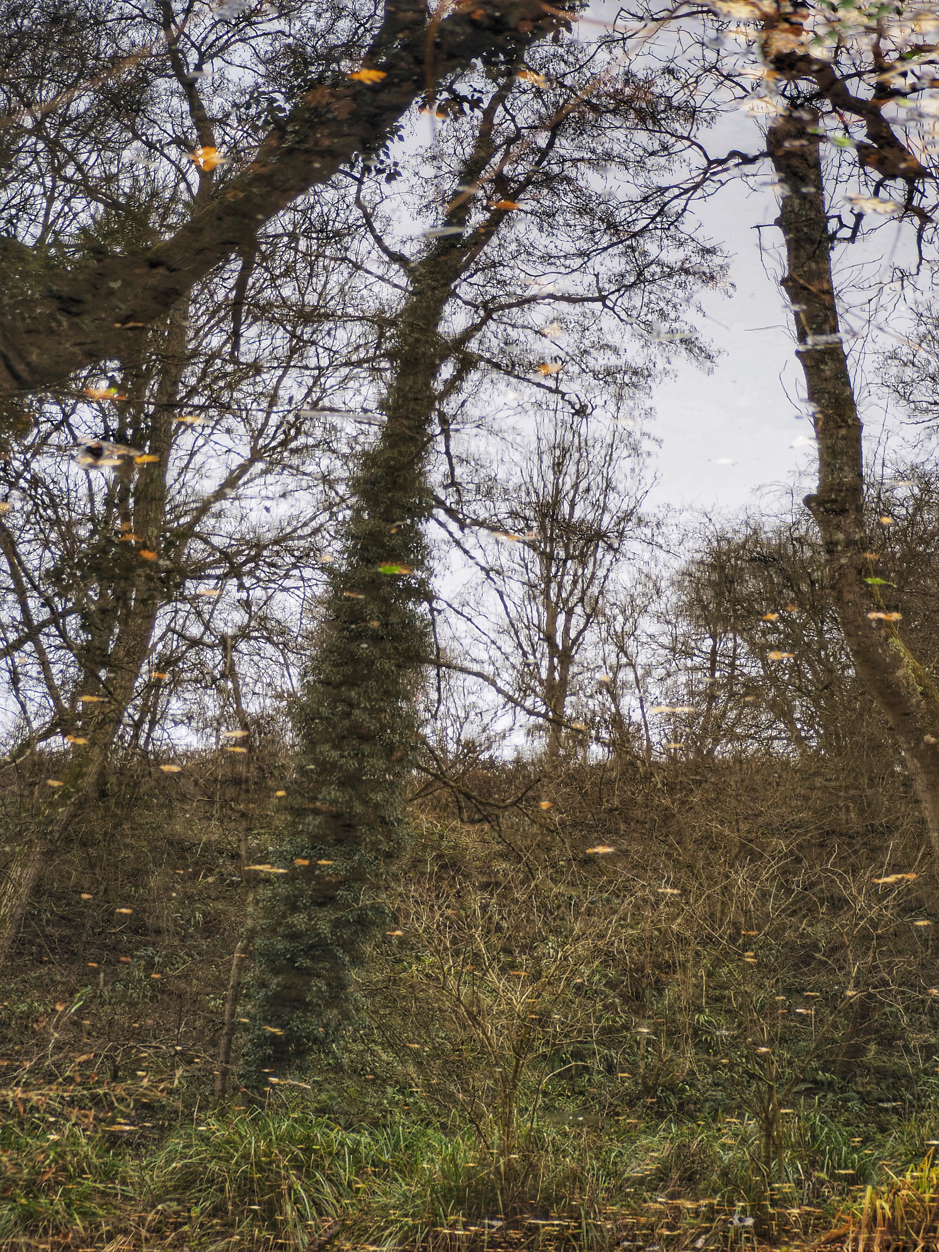
Image 7
Development of the assignment from the original exercise in Part 4
For this assignment, I decided to focus on the qualities of natural light by photographing the reflections of trees in a local lake and beside a nearby canal.
In Exercise 4.1 I became interested in the shadows cast by trees in strong sunlight. I particularly noticed these shadows cast on a dry gravel path (it was midsummer at the time). As autumn came around, bringing wind, rain and the natural changes associated with the season, I began to notice the reflections made by trees in bodies of water. What drew me to these reflections was the idea of ‘capturing the qualities of light’ – as per Exercise 4.1. I found this idea challenging because it is all too easy to take photographs of ‘things’, but how to capture and express the quality of light itself?
My chosen approach, I felt, created the possibility of capturing not just the subject of the picture (in this case, trees), but their reflections, the leaf detritus floating on the surface of the lake / canal, and the light reflecting off the water itself – almost three things in one picture. I loved the aesthetic created by this approach – often dreamy and slightly surreal – painterly even.
Building on this ‘painterly’ idea, I had found myself thinking about how painters chose their palettes (I also paint) and, thinking about pixelation (which I have studied from a number of different angles during this course), how this could be used as an aid to palette selection.
I also found it remarkable how the different qualities of daylight affected the colours in a scene. I first realised this when taking pictures of the sky and the sea under different weather conditions – an exercise which, in itself, informed this choice of assignment as I discuss here.
These thoughts then took me off on a technical tangent, exploring and trying to understand what were, for me, new concepts and terms to define qualities of colour. My learning on that subject is presented here.
Finally, I wanted to accentuate the ‘painterly’ qualities of my images, particularly in a style reminiscent of the impressionist painters – for whom capturing the light was an essential element of their work. Hence the idea evolved, over several weeks, of preparing and presenting a series of triptychs consisting of a ‘normal’ photograph of a tree / trees reflected in a body of water, a pixelated version of the image to display the colour palette, and a ‘painterly’ version of the image in an impressionistic style.
Inspirations and influences
The Impressionists
In a general sense, the impressionist style of painting has been, I would say, a subliminal influence on the body of work I present here. I say that because I have had a lifelong interest in Impressionist paintings – it wasn’t that I looked at any particular paintings and then went out with my camera to replicate the effect.
One of the things I enjoy about the Impressionists is how they set out to capture the qualities of light – a definitive characteristic of the Impressionist movement – together with the dreamy atmospheres they created. Many of the landscapes of Sisley and Pisarro, for example have the dreamy, meditative qualities that I was after in my own images.
Talking of meditation, I came across an interesting quote about Sisley, apparently made by his friend Gustave Geffroy: “I have never forgotten the splendour of the trees, the glades and rocks of which he spoke so poetically; nor indeed his account of the lives and troubles of the river folk whom he knew so well through his studious and reflective existence spent by the river banks and beneath the poplar trees.” (Nathanson, 2020)
I was struck by the dual meaning of the word ‘reflective’ here which I wanted to capture in my own work – the literal reflections made by the trees in the lake, but equally, referencing the psychological state of the artist (photographer, in my case).
Aside from the Impressionist style of painting, I also enjoy the colour palettes used in many of their landscape paintings, especially the greens. I feel that my photographs definitely have similarities with these palettes and it was the palettes that I wanted to reveal in the pixelation conversion of my selected images.
If pressed to identify particular paintings which illustrate the general points I have made above, a (very) small selection of relevant works of interest / influence would include:
The Sheltered Path (Chemin creux) by Claude Monet:
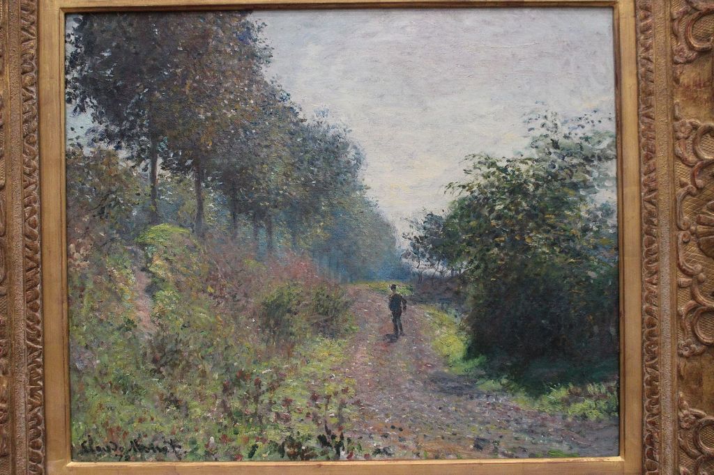
I am drawn to the shimmering effect of the trees in this painting which I tried to achieve with the ‘painterly’ conversions of my photographs. The contrasting spots of colour in the foreground echo the leaves floating on the water in my Image Set 5. This painting has a beautifully soft, light feel to it.
The Fence (La Barriere) by Camille Pissarro:

The style in which this tree is painted is the effect I was looking for when converting my photos to ‘painterly’ versions. I feel that Image Set 1 was a particularly successful conversion.
The Ferry (Le Passeur) by Willian Stott of Oldham
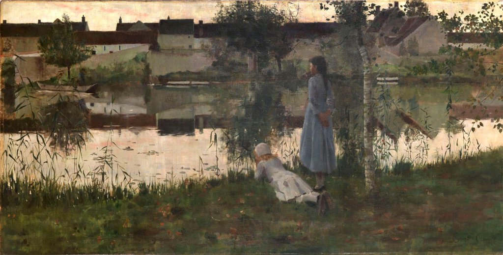
Beautifully captured light reflected on water and a simple palette. I enjoy the earthy autumnal greens and browns in this.
La Marcellerie by Ruger Donoho

I love both the style and the palette in this painting – it comes closest to the effect I have tried to achieve in my photographic series. Again, the spots of colour on the painting, especially in the foreground, depicting leaves are similar to the effect I achieved in Image Sets 2, 5, and 7.
It would be easy to go on relating my work to different painters, but my intention here is merely to give the general flavour of my Impressionist influences.
Two other painters worthy of mention though – for slightly different reasons, are Seurat and Klimt.
Seurat developed the pointillist style of painting, painting dots of different colours next to each other to create a vibrancy in the finished work. The colours are ‘blended’ in the viewer’s mind rather than on the palette. I certainly see a parallel here with pixelation. Indeed, I wrote a separate blog post about this here.
Gustave Klimt’s landscapes have been a very strong influence on my style, again he takes a somewhat pointillist approach in many of his tree paintings, using contrasting dots of colour – yellows, golds, and oranges to depict autumn leaves. His Fruit Trees (1901) is a fine example, as is The swamp for the way it captures the quality of light in the reflection on the water:


David Parfitt
David Parfitt is a contemporary watercolour artist who often paints postcard-sized depictions of tangled undergrowth and reflections in water. I feel that his influence is particularly apparent in Image set 2. One of the things I like about Parfitt is that he is drawn to the untidyness of nature, depicting tangled undergrowth and wayward twigs. I was very conscious of this at the editing stage – it would have been very easy for me to ‘tidy up’ some of my images – particularly by digitally removing some of the detritus floating on the surface of the lake / canal. By and large, I retained it as I wanted to maintain that ‘messy’ look that one finds in nature.
Perhaps because he works in watercolour, I find he achieves an exquisite, liquid luminosity in his paintings and like Klimt, he creates a speckled effect to depict leaves and light.
A fascinating discussion of Parfitt’s work can be found here, together with a handful of his paintings.
Thomas Ruff
When I first looked at the work of Thomas Ruff earlier in the course module, I was not particularly impressed by his pixelation work. However, as time has passed, I have found myself returning to the idea of pixelation again and again. I have been particularly interested in it’s ‘political’ uses as described by Mishka Henna and Thomas Hirschhorn.
For this assignment though, I have used pixelation for the specific purpose of creating a colour palette. This began as an exercise on the seafront – taking a photo of the same view of the sea and sky each day and pixelating it to show how the colours differ depending on the light. There is an example here. This reminded me of Spencer-Finch’s sea palette installation on Folkestone’s seafront, which depicts 100 different colours of the sea, derived from photographs taken over a period of several months.
Although I then decided to focus on tree reflections in water, I wanted to do something with this ‘palette’ idea, so I did some further research and came up with an interesting article on artists’ palettes which aided the formulation of my ideas for this assignment – namely, to create a series of groups of three images comprising the following elements:
- A straightforward photograph of the scene
- A pixelated version of the photograph to disclose the colour palette
- An edited ‘painterly’ version of the original image showing how the palette might be used in a painting
Sally Mann
I discussed Sally Mann’s work in an earlier blog post here. I particularly enjoy her emphasis of creating mood and emotion through the use of shadows. These are qualities which I hope emerge from my own work here.
Rinko Kawauchi
Of all the photographers considered on the course so far, Kawauchi is my own personal favourite as I feel that she really is the mistress of light! Her work was an inspiration as it helped me to think much deeper about photographing the qualities of light as opposed to just photographing ‘things’ in the light. I wrote about her work here.
In my final selection though, I don’t feel that her influence is that obvious – I did have one other photo that I was considering for the set, but ultimately felt that it didn’t gel with the others. This is the picture:

What I liked about this picture is the actual reflection of the sunlight on the water and not just the reflection of the tree. These types of images are quite difficult to achieve naturally as the light has to be at a particular angle. It is the only scene that I saw that looked like this in nature.
Technical approach
The pictures were taken in late summer and into autumn using my Olympus EM10 Mark 2 (which died in the summer), my Olympus EM1 Mark 2 (which replaced it), and my Lumix TZ200. I completed my fieldwork in four separate visits to Brockhill Country Park and the local canal.
I worked mainly in manual mode, but aperture priority on my Lumix. Contact prints show that I used a range of different aperture / shutter and ISO settings. I enjoyed being quite experimental.
The trees that feature in the images were growing on the opposite bank from where I chose to stand, therefore, once home, I had to turn all the images upside down. I then cropped off parts of the image that were not actual reflections whilst maintaining the aspect ratio so that my selected images would all be the same dimensions.
Minor edits included a bit of brightening, pulling out shadows, enhancing contrast etc., but nothing major.
I then used iColorama to pixelate each image and then a painterly preset, with added texture to create the third images. I did wonder at this stage about using different painterly presets for each image, but decided I would rather maintain consistency.
After making my selection of best images, I sent them away to be printed by a company called Touchnote. As I discuss towards the end of my blog post here, the final prints were not as vibrant as the images viewed on screen. I now understand why.
I then used an app called Diptic to make each three-frame video.
Strengths and weaknesses of particular photographs and the project as a whole
At first glance, I don’t think it immediately registers that the pictures are reflections of trees in water. Even I was surprised by how sharp some of the details are in some of the photographs – for example, the branches and twigs in Images 1, 4 and 7. It requires something of a double-take to notice the leaves floating on the surface of the lake – for example, in Image 7.
What is going on is given away more readily in Image 6 by the ‘flying saucer’ effect of the ripples from a drop of water on the surface. Does this make a good image – or are the rings a distraction? – I haven’t quite decided but I think it is one of the weaker images in the set for that reason.
Images 3 and 5 are more obviously reflections because the surface of the water is more disturbed. I particularly like the surface leaves floating on the water in Image 5, and Image 3 has a touch of Monet about it. I feel that these are my strongest images – interestingly, they were the only two pictures I chose that were taken by the canal rather than the lake.
I notice also that in Images 5 and 2 that the leaves on the surface appear larger towards the top of the frame – a reversal of the perspectival effect that one would expect. I think this adds to the surreal, dreamy quality I am looking for and it is caused by the fact that we are viewing the image upside-down. I very much enjoy Image 2 for its autumn colour and touch of the David Parfitt style!
I thoroughly enjoyed this project overall and could have spent a lot more time on it. I am minded to continue working for a whole year to capture the trees through all four seasons and putting the images together in a photobook. I think that I have done enough on pixelation to make the point about palettes and this has been a very useful and thought-provoking exercise.
One disappointment relates to the quality of the prints and, in particular, the major difference in colour compared to when the pictures are viewed on a screen. On another occasion, I will print the images myself. My relatively new learning about some of the technicalities of colour has shown me that, at the very least, I need to do some monitor and printer calibration.
A further task is to continue my learning about colour theory.
Personal reflection on creativity
I feel that I have been very creative in the interpretation and execution of this assignment, whilst drawing on a number of different artists, photographers and styles. Most people, I suggest, at the mention of the word ‘tree’ would envisage a tree in a ‘normal’ landscape setting. I have, quite literally, turned that idea on its head!
I also feel that the reflective nature of the images gives them a more etherial yet vibrant quality. They evoke mood and atmosphere in a way that a straightforward record shot of a tree would not. At the same time, they have a very subtle ‘double exposure’ look about them, depicting as they do, both the tree and the leaves and detritus on the surface of the water – exactly what I was hoping to achieve.
Given the time of year, I am now very keen to explore other bodies of water, perhaps a little further from home so that I can take more pictures and develop my ideas and skills further still. This has been a fabulous opportunity to ‘think outside the box’.
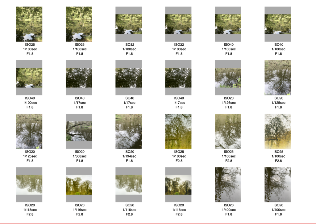
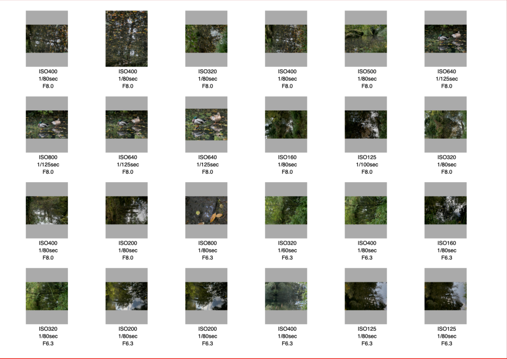
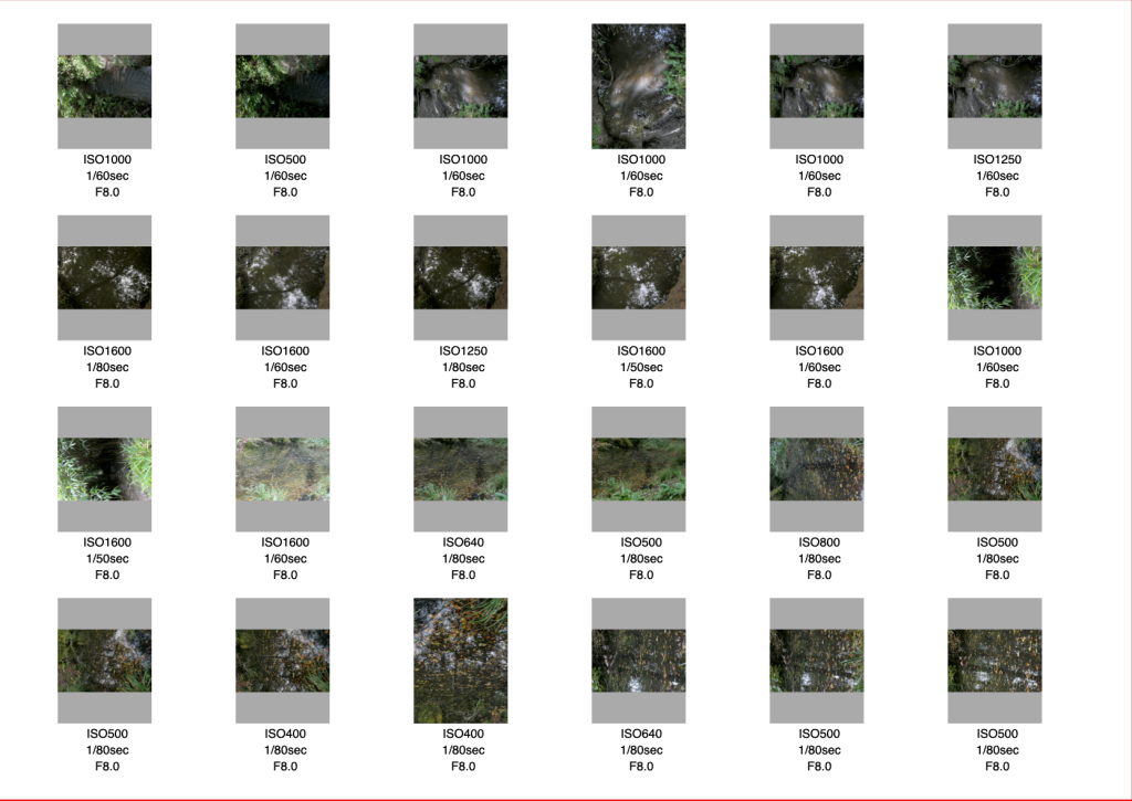
Contact Sheets


References
Nathanson, R. (2020) Publication: Alfred Sisley: An exhibition introduction At https://richardnathanson.co.uk/publications/11/ (Accessed 25/10/20)
House J. (1995) Landscapes of France: impressionism and its rivals London: Hayward Gallery
Koja. S (2012) Gustav Klimt landscapes Munich: Prestel Verlag
Seamless Expression (2018) Spotlight on an artist – David Parfitt At http://www.seamlessexpression.com/blog/2018/1/25/spotlight-on-an-artist-david-parfitt (Accessed 21/10/20)
Symonds H. (2019) Colour palettes used by 10 famous paintings to help your colour At https://www.haydnsymons.com/blog/the-colour-palettes-used-by-10-famous-paintings/ (Accessed 20/10/20)
Kawauchi, R (2011) Illuminance New York: Aperture

[…] in addition to standard image correction, have included the creation of double exposures, the pixellation of images and turning photographs into pencil drawings using a mask. I have also created a short slide […]
LikeLike
[…] I regard Assignment 4 (qualities of light) as my best assignment. I have reviewed the images presented there, and have […]
LikeLike